
Bluetooth ‘UX Style Guide’
Designing a "single source of truth"
Overview
Role: UX Engineer - contractor - 3 months
Task: Design & develop a style guide that the entire company can leverage
I was contracted to improve the existing style guide tool, but there were many issues with the tool as described below. In the following sections I'll discuss a few of these issues and what steps I took to address them.
The problems, impacts, and goals were determined during a project planning phase. Many of the problems were complaints that the UX team had received but were unable to address with the existing implementation.
Although I was hired to make recommendations and to complete work on the existing tool, after conducting user interviews it quickly became apparent that the tool they had was too much work to maintain and was inadequate to meet their needs.
Through the interview process, the UX team was able to identify a number of issues surrounding the style guide and its usage, and the primary issues are documented in the next section.
Problem & Goal Statements
Click any image to zoom
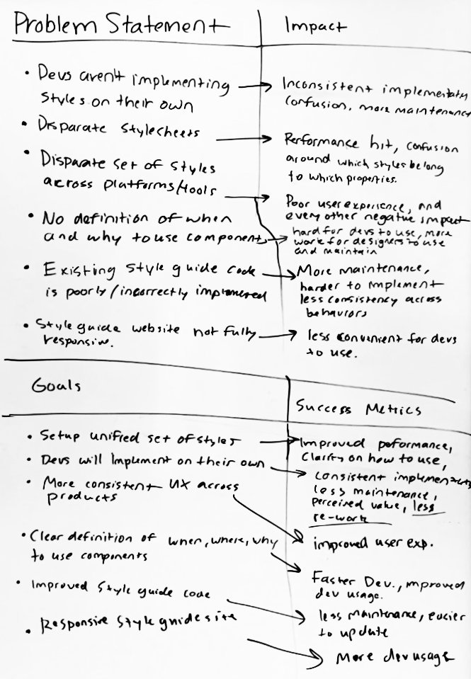
The problems we felt we could address through improvements to the style guide are highlighted in yellow below. The remainder of the issues will be addressed by the UX team through policy updates and content inventories.
Problems:
- Developers aren't implementing styles from the guide
- There are too many disparate styles and style sheets
- There are disparate styles and UI components across platforms and tools
- The style guide provides no definition on when/why to use components
- The style guide website is not fully responsive
- The existing style guide is poorly coded
Impacts:
- User interfaces are inconsistently implemented and harder to maintain
- Multiple style sheets decreases performance and creates confusion around which styles belong to which properties
- Users of our products and tools are subject to an inconsistent, poor user experience
- The style guide website is inconvenient for developers to use
- The style guide website is difficult for designers to use and maintain
Goals:
- Improved consistency of style implementation
- Develop a unified set of styles
- Clearly define usage guidelines around components
- Remove obstacles to style guide usage
- Improve underlying style guide code
- Minimize maintenance effort
Research: User Interviews
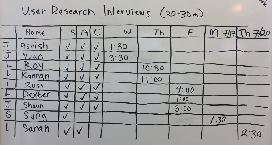
Our initial round of interviews conducted with influential developers helped us identify some workflow issues and a general lack of awareness of the intent of the style guide. We were also able to confirm the frustrations with the guide that had been expressed by its few users prior to my start.
Reviewing our research data, I was able to identify 3 unique user personas:
- Developers using Bootstrap
- Developers on other platforms
- Designers, Marketing, QA, and Management
Needs:
- Visual reference for styles
- CSS class names
- Element properties (full CSS)
- (Occasionally) HTML snippets
- Clear documentation about changes
- Component usage guidelines
- Pattern files
Pain Points:
- Difficult to find style guide when needed
- Difficult to reference (too much code)
- Difficult to reference (not enough code)
- Insufficient content (usage guidelines & components)
- Lack of communication about style guide updates
- Visual styles are not consistent between style guides
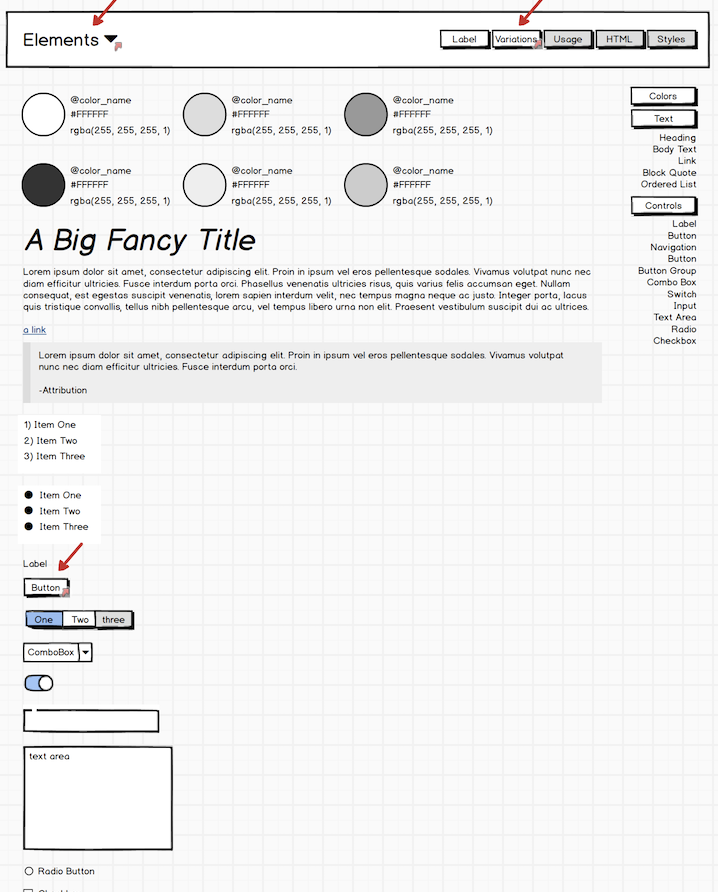
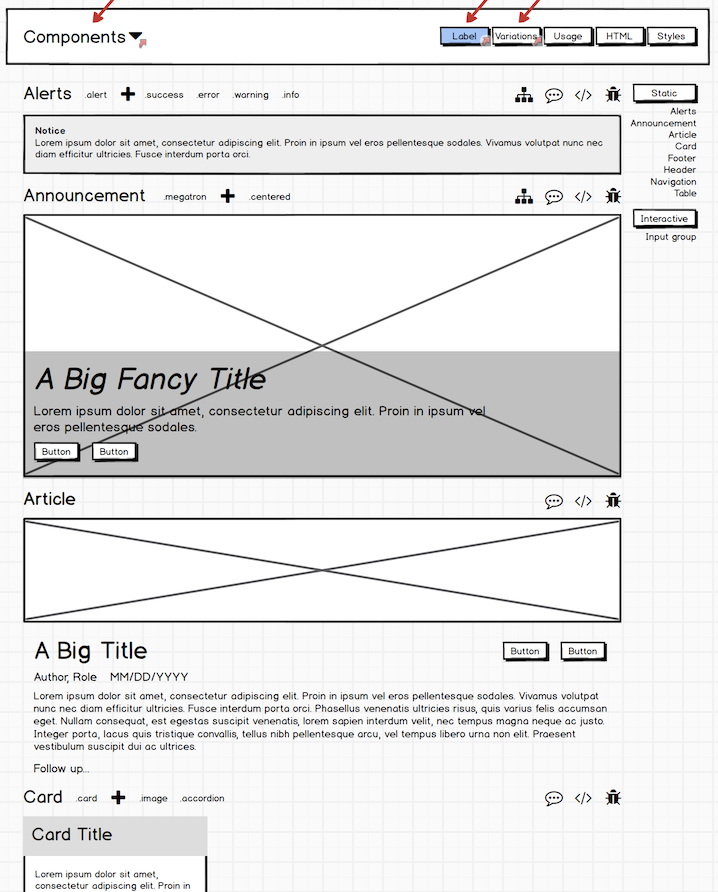
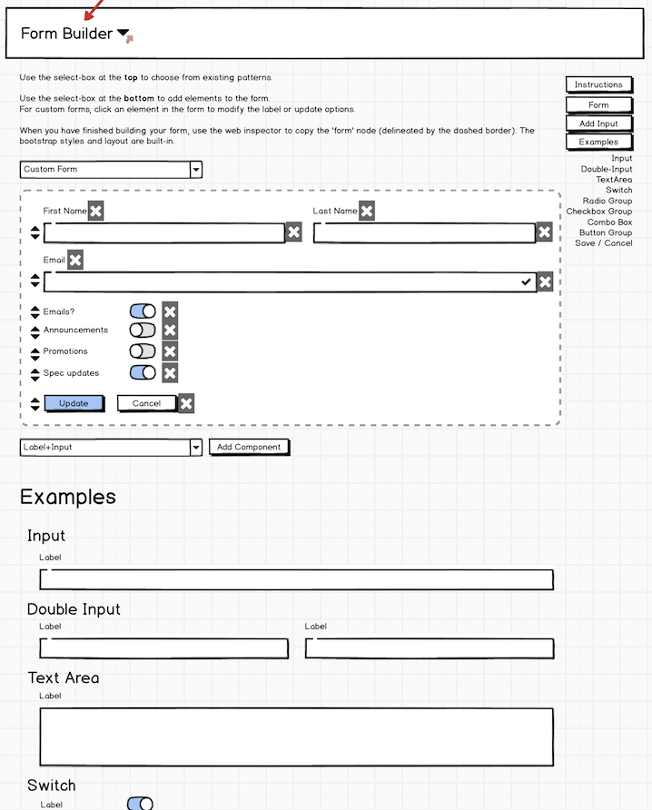
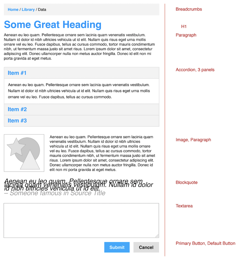
Research: Prototyping
 (click to expand) collapse
After the initial round of interviews, I created a set of low-fi mock-ups in Balsamiq based on the feedback we'd received.
Using these mock-ups, I facilitated discussions with the UX team around features and content. Together we determined which features were necessary and which could be cut.
Between discussions, I researched a number of existing ‘pattern library’ solutions and eventually built prototypes using the 3 platforms that seemed like they would get us closest to our defined goals. The platforms I built prototypes on were: Fabricator, AtomicDocs, and Swanky Docs.
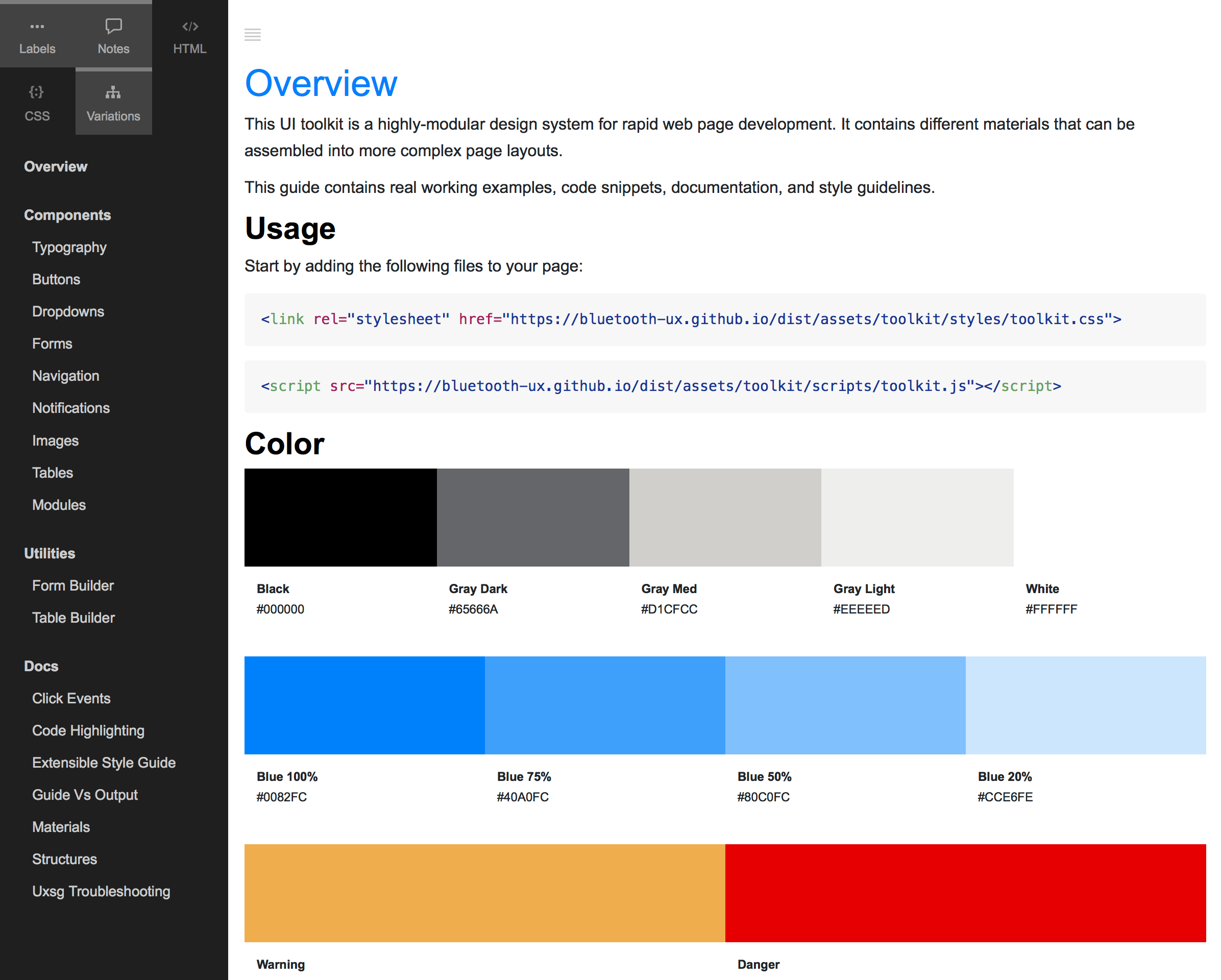
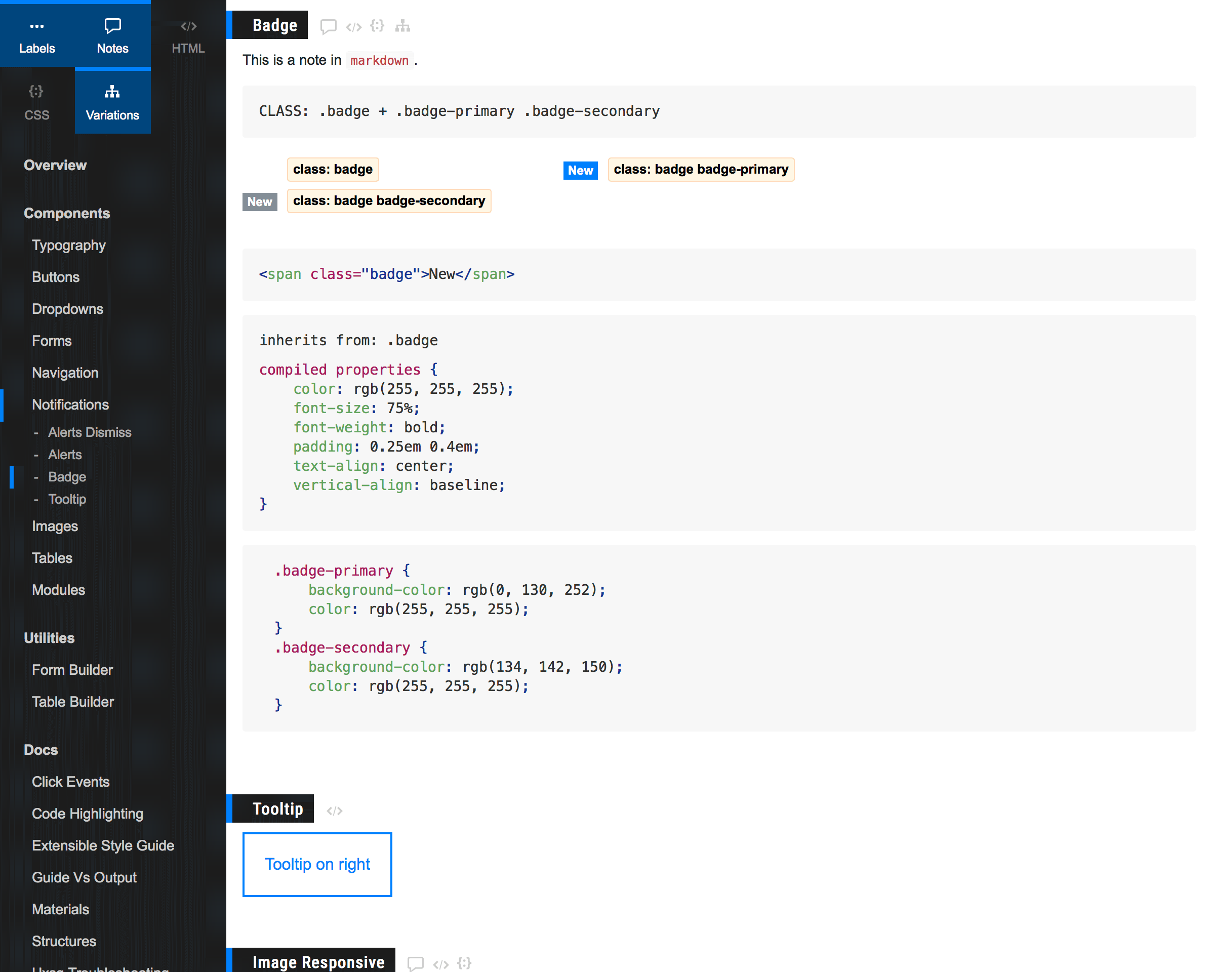
Research: Usability Study
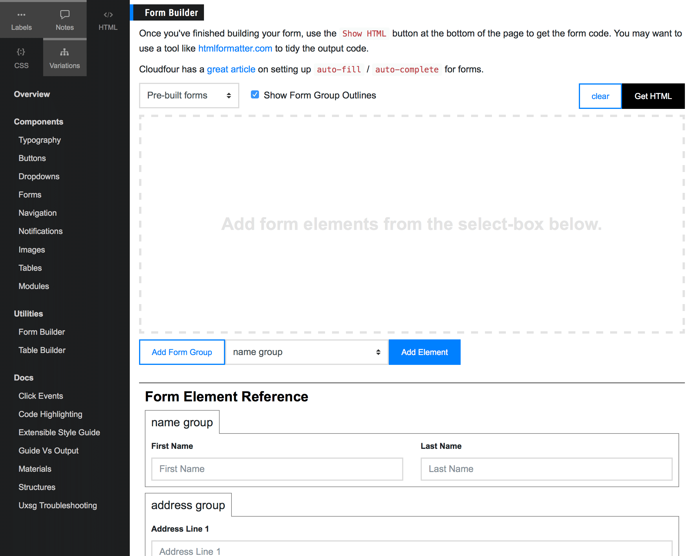
After reviewing the pros and cons for each platform, the UX team and I decided on moving forward with Fabricator.
Before making any major modifications to the platform, I planned a usability study to determine how well the platform met the developers' needs.
Each study session began with a brief overview of the tool, followed by an explanation of the exercise. The participant's goal was to find the corresponding code that was necessary to reproduce the mock-up I'd provided.
While the participants worked, I took notes on the ways that they interacted with the tool and asked probing questions around their intent when they got stuck.
The observations I made during the study were invaluable to improving the usability of the tool, especially because each participant seemed to have a unique approach to navigating the content.
Conclusion
 (click to expand) collapse
After discussing my study observations with the team, I proposed a few modifications to the tool including an updated information architecture, and more robust content. The UX team also requested a number of features around navigation and content labels.
While the UX Engineer on staff migrated the remaining content from the old guides, I built out and documented a robust framework for generating content and supporting future updates.
Finally, I gave a presentation to the designers, developers, and product managers describing the goals of the project, and the features of the final product.
Over the course of our research, we'd discovered that many developers were aware of discrepancies in the guides and had a mild fear of relying too heavily on the content as a result. Faith in the tool was the final piece of the puzzle to improve adoption among development teams, and I used the presentation as an opportunity to build faith by explaining how the guide content is generated in a way that significantly reduces the opportunity for errors.
Final Presentation Deck See the Guide
My final code commit was September 29, 2017.